7 min read
Getting started with Qlik Predict: from model to action

Predicting the future: who wouldn't want to? With Qlik Predict (the new name for AutoML), you can easily create predictive models based on your data. Qlik Predict automates a large part of this process for you. In the previous blogs, we explained how to prepare your data with feature engineering and how to select the best model. In this third part, we show how to actually put the trained model to work in your organization: operationalizing your model.
From experiment to deployable model
Once you are happy with the result of your experiment, you can deploy the model. This means making the model available to generate predictions. In Qlik, this is done through a so-called ‘ML deployment’. You can deploy a model to a new or an existing deployment.
Once you have added one or more models to a deployment, at least one of the models must be approved before it can generate predictions. If you have multiple models, you choose one of them as the “default” model; for the other models you can create ‘aliases’. You can use these aliases to call the right model.
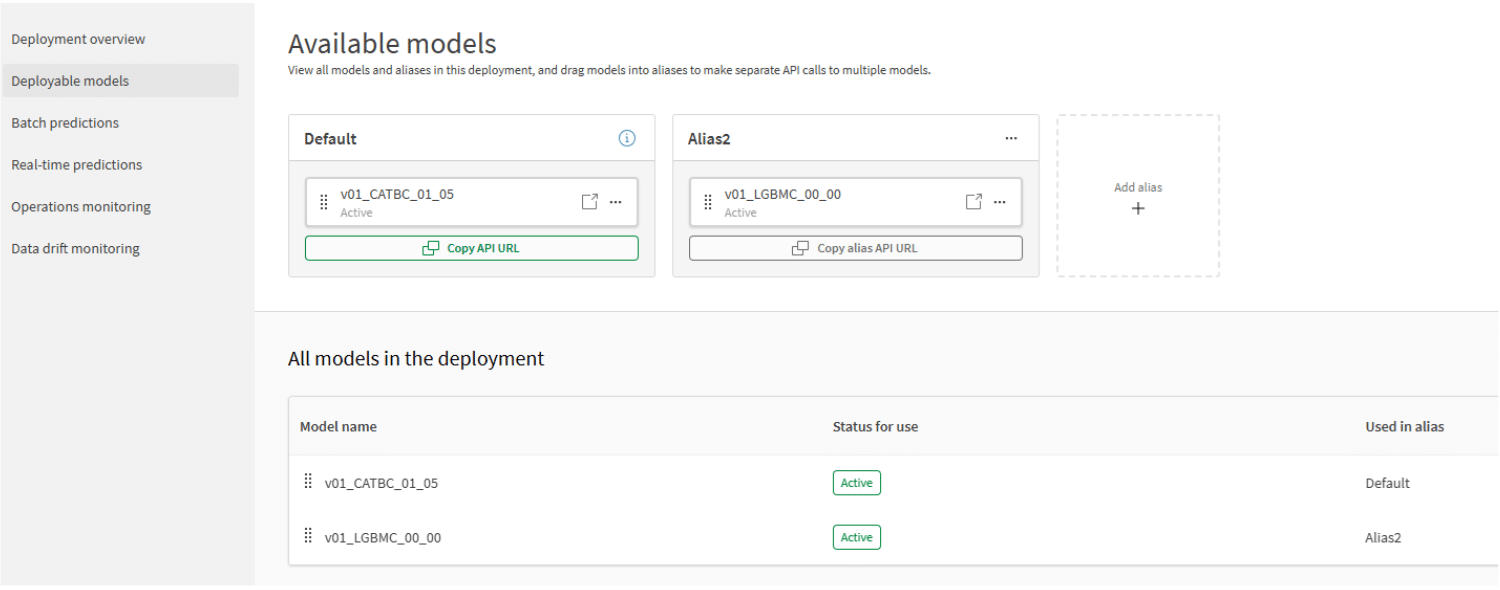 Figure 1: Deployable models (click the figure for a larger view).
Making predictions: manual, scheduled or real-time
Once the model has been approved, you can use it to generate predictions. There are three ways to do this:
- Batch prediction: in the deployment interface, you choose an existing dataset as input for the prediction. Qlik checks whether the correct features are present based on column names. You then choose the model you want to use, specify the output dataset, the location where it will be stored and its name, and choose the format in which it will be saved (qvd, parquet or CSV). Finally, you can choose whether this export runs once or on a recurring schedule.
- Real-time API: A URL is generated for each alias in a deployment. This is a REST API endpoint where you can generate a prediction by means of a POST call. This method is ideal when you want to integrate your predictive model with another application outside the Qlik platform.
To generate a prediction, you pass an “Authorization” header with a valid API key, and in the body the correct column names matching the model's features. An example of a body for such a call is shown below:
{
"rows": [["feature1value", "feature2value"]],
"schema": [{"name": "feature1"},{"name": "feature2"}]
} - Analytic connection: If you want to integrate live predictions into a Qlik dashboard, you can use a so-called “Analytic connection”. You create the connection in the same way as a data connection in the load script. Once you have created the connection, you can generate a prediction in an expression using Server-side Extension (SSE) syntax. An example expression looks like this:
=endpoints.ScriptEvalEx(
'SSSSN',
'{"RequestType":"endpoint", "endpoint":{
"connectionname":"MyConnection",
"column":"MyTargetColumn"}}',
[Feature1],
[Feature2],
[Feature3],
[Feature4],
[SyntheticDimension] as [Feature5]
)
The call always starts with endpoints.scriptEvalEx. The first parameter is a string made up of the letters S (String) and N (Numeric), indicating which type of data is expected in each of the features. Next, you pass the name of the analytic connection and specify the name of the column you want to predict. Finally, you pass the various values you want to use for the simulation. By choosing columns from your data model, you make the prediction dynamic, so it responds to the user's selections.
From prediction to action
Now that we know how to generate a prediction, it's time to make it part of your dashboards. If you have made a batch prediction, you now have a new dataset that you can load into your model just like any other dataset. The dataset contains a key to your data model and, depending on the type of predictive model, a number of columns with the prediction. If you used binary or multiclass classification, for example, you will have one column per label containing the probability the model assigns to that label being correct. Suppose you have built a binary classification model that predicts whether or not a customer will keep their subscription: with this information you can create a KPI object showing the number of customers at high, medium or low risk of cancelling their subscription.
The next step is to give your users insight into why the model makes a particular prediction. For this you can use so-called SHAP values, which can be generated along with a prediction. For each feature in your predictive model, you then get a value between -1 and 1 for every predicted row. A positive value means the feature had a positive influence on the predicted outcome, and a negative value means a negative influence. The higher the value (or, for negative values, the lower), the greater the influence.
Figure 2 shows an example of how predictions and SHAP values can be used in a dashboard. The bar chart on the left shows, per bike, the predicted probability that the bike will be delivered late. The bar chart on the right shows the SHAP values per feature. As you can see, the columns “Customer location”, “Transport Company” and “Model Configuration” contribute most to late delivery, whereas the “Planned Delivery Season” has a positive influence on on-time delivery. When the user selects a specific delivery, the SHAP values update so the user can see which factors have the greatest influence on that particular delivery.
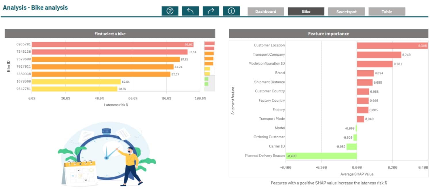
Figure 2: Predictions and SHAP values (click the figure for a larger view).
What-if scenarios and sweet spot analyses
By using the analytic connection, you can enable users to perform even more advanced analyses. For example, you can let users choose input values via a variable input box, after which a new prediction is generated. That way you can see, for instance, what effect changing a supplier has on the probability that the delivery will arrive on time.
Even more powerful is performing a so-called sweet spot analysis. In a sweet spot analysis, you simulate a large number of combinations of feature values at once and plot them, for example, in a scatter plot. Figure 3 plots the probability of late delivery for each possible supplier against the cost of using that supplier. This lets you see at a glance which supplier offers the right price/quality balance for this specific delivery. If you then give the user the option to confirm that choice through an application automation flow, the circle is complete.
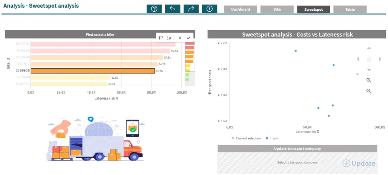 Figure 3: Sweet spot analysis (click the figure for a larger view).
Keep your model healthy: monitoring and replacement
A model is not static. The world changes, and so does your data. Suppose, for example, that in the 1990s I had trained a predictive model to forecast how much petrol my filling station sells each month. That model would have produced perfectly good predictions for some time, but with the arrival of electric cars and increasingly fuel-efficient modern engines, it would make less and less accurate predictions. Qlik Predict automatically monitors whether the data on which predictions are made still resembles the data the model was trained on. This is called data drift monitoring. Qlik uses a metric called the Population Stability Index (PSI) for this. A PSI below 0.1 means everything is stable. Between 0.1 and 0.25 there is slight drift, and above 0.25 it is time to retrain or replace your model.
Besides model drift, it is also important to monitor for errors when making predictions. Errors can occur, for example, because features are missing or suddenly contain values that were not seen during training. Suppose I had the feature “colour” as input, and my training dataset contained the colours “red”, “green” and “blue”. If I then try to generate a new prediction with “orange” as the colour, the predictive model won't know what to do and will generate an error. When you run a batch prediction, you can choose to write an Error table alongside the predictions and SHAP values. This helps you keep an eye on whether errors occur and where you need to take action.
Does your model need to be replaced? No problem. Thanks to model aliases, you can link a new model to the same deployment without having to change your dashboards or API calls.
In conclusion
Training a predictive model is only the beginning. The real value comes when you put the model to work in your processes, dashboards and decisions. With Qlik Predict, operationalizing a model is simple, scalable and easy to manage. By integrating your predictive model into your dashboards, you can really start taking action based on the insights you gain. And that is exactly how you get the maximum value from your predictions.
Stay up to date
Don't want to miss a blog? Then sign up for our newsletter. You'll receive all the latest content straight to your inbox every month. You can sign up using the button below. sign up here

Written by
