8 min read
7 tips to fall (back) in love with your data

For a long time, you were happy with your Excel reports. With the click of a button, you had an export of figures from your most important system. But over time, more and more data sources and employees were added, each with their own data exports and analyses. Slowly, the spark between you and your data faded… Fortunately, we have found a few tips to help you fall in love with your data again. Curious whether the spark will return? Read our tips below.
#1 Choose the right BI tool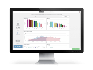
After your bumpy relationship with Excel, you are more than ready for things to run a little more smoothly. Fortunately, getting started with a Business Intelligence (BI) tool does not have to be a complex or lengthy process at all. It is, however, important to choose the tool that suits you best.
With BI software from Qlik or Microsoft Power BI, you can build a fully working dashboard within just a few days. Both Qlik and Power BI are so easy to use that you simply drag and drop your data into the app. Then you drag in the visualizations you want, and within minutes you have a complete, dynamic dashboard to click through and analyze further.
Qlik
With Qlik, you can choose to connect directly to your data sources, so no external data warehouse is needed. For smaller organizations this can save costs, but it does mean that all business logic and data connections live in the dashboards and may have to be recreated several times. It also means that switching to another tool, or adding an extra tool, can be difficult.
That is why at E-mergo we often recommend capturing the logic and data connections in TimeXtender, if the budget allows.
Power BI
Power BI gives you a user-friendly BI tool that is also part of the Microsoft Power Platform. This brings numerous benefits and opportunities for your organization. The BI tool is extremely popular and has a large following. It has been a leader in the Gartner Magic Quadrant for Analytics and Business Intelligence Platforms for 14 years. Microsoft also releases monthly updates, so you always have the latest and best version of the software. On top of that, Power BI is ideally suited to be combined with TimeXtender.
When you start with data analytics, there is no single off-the-shelf solution that works for everyone. That is why at E-mergo we look at your situation and, based on that, choose together what fits your organization best and will deliver the desired result. That could be Qlik or Power BI, with or without TimeXtender; it differs for every situation and set of requirements.
#2 Don't expect your BI tool to make your data better
BI tools are very good at visualizing data, but if the quality of the data is poor, your tool cannot change that. So don't expect all your relationship problems to be solved in one go. Research by Gartner from 2017 also shows that bad data is a major problem: it found that the average company loses 15 million dollars due to poor data quality. This shows up in lower customer and employee satisfaction, rising costs and poor decision-making, among other things. [1]
Poor data quality is usually caused by poor or entirely missing data management. Think of poor data verification, no documentation of the complexity between systems, no data definitions and a lack of work instructions. A tool that can help a great deal here is TimeXtender. TimeXtender is a Data Management Platform used to collect and manage data and business logic centrally.
#3 Your BI tool is not Excel
Old habits die hard, which is why perhaps one of the most important things to know is that a BI tool is not the same as Excel. BI tools have far more capabilities and features than Excel, and it is crucial to respect the differences between them. So don't try to do the same things in your BI tool that you would normally do in Excel.
A BI tool gives you many more possibilities than Excel. Another big advantage is that you spend less time with your tool than with Excel, because it automates a great many processes.
#4 Start with good KPIs
A good start to your relationship is often half the battle. Only by first thinking carefully about what your goals are and what role data plays in them can you create good dashboard designs. It is also important to agree on how detailed the KPIs should be. Management often wants a high-level overview of KPIs, while at the operational level there is a need for detailed KPIs. By drawing up a KPI tree, for example, you can easily show the relevant KPIs for each layer.
Moreover, if you start developing your BI platform without first paying attention to the KPIs, you will notice that different KPI definitions exist within your organization. By working this out in advance, you prevent discrepancies in your data.
Want to know more? We have written two blogs about it: “This is why your KPIs fail” and “Do your KPIs measure what you really want to know?”.
 Marketing: “An account is a converted lead.”
Finance: “An account, for reporting purposes, is a customer with financial resources who can do business with us.”
Accounting: “An account is a recorded entry in our back office, bookkeeping and records.”
Legal: “An account is a structured product that we offer our customers through a legal agreement they sign.”
#5 Connect all your data in one central place
When your organization starts implementing BI software, it is important that data is safeguarded in a secure, central location. After all, you don't want anything to happen to your beloved data. A data warehouse is an example of such a location. This ensures that, whichever analytics tool is chosen, all data can always be accessed up to date from one central place. It also prevents tools from connecting directly to data systems such as SAP, which can have a negative impact on performance.
In addition to having a central place for your data, it is also important to properly arrange version control and data lineage. Data lineage shows you exactly where data comes from and where it is used. Version control ensures that changes to analytics applications are documented and stored, so that you can, for example, restore an older version after an incorrect change.
The Golden Triangle
 Although Power BI also lets you collect and manage your data, using a cloud platform such as Azure and a Data Management Platform such as TimeXtender is much more convenient and faster, for example when working with larger datasets. At E-mergo, we are convinced that when you use Power BI as your Business Intelligence tool, there is an ideal combination to be made between BI, cloud and data management tools. This combination consists of Microsoft Power BI, Microsoft Azure and TimeXtender, and we call it the ‘Golden Triangle’. Read the blog about the Golden Triangle via the button below.
The Golden Triangle
#6 Use the right data visualization
The design of your dashboard matters too, of course. Poorly chosen data visualizations can undermine the interpretation of the data. Your dashboard design and choice of visualizations should be functional and convey information in the clearest possible way.
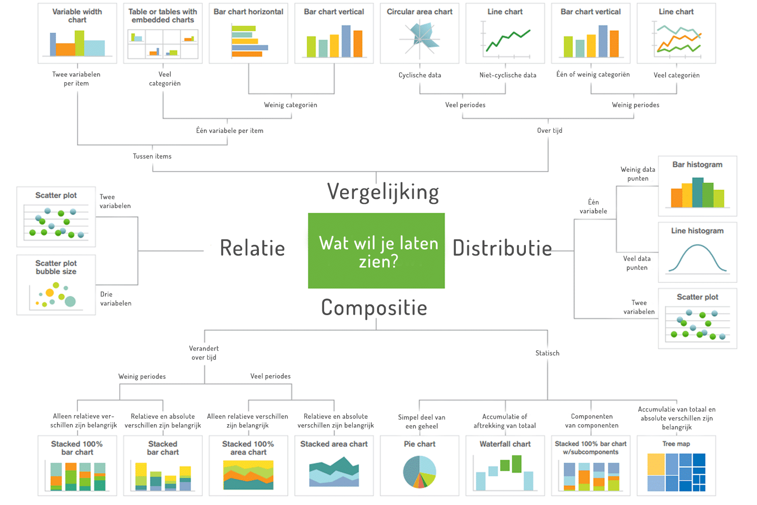
Need help? In this decision chart you can easily find which data visualization best suits your data. Choosing the right visualization avoids confusion and ensures the data is interpreted correctly. Besides choosing the right visualization, it is also important not to use too many, so the overview stays clear. Read the blog ‘10 pitfalls of dashboard design’ for more important points to keep in mind when designing your dashboard.
#7 Take a beginner's course
A tip we like to give our customers is to have end users take a beginner's course in advance. These trainings often last only half a day, and you learn the basics of your chosen data analytics tool in a short time. You are also in a group with other beginners, each with their own questions about the tool, which you can learn from as well.
At E-mergo, you can of course take such a beginner's course for Power BI and/or Qlik. These courses are completely free and online. Sessions are organized regularly for both tools, giving our users the opportunity to get off to a flying start in Power BI or Qlik Sense.
Fall (back) in love with your data webinar
Want to discover more about how to fall in love with your data again? Sign up for our webinar ‘Fall (back) in love with your data’ on 14 February. During this special Valentine's Day webinar, our Data Strategy Leader Louis de Roo explains why the fire sometimes goes out, and you will be introduced to 3 ways to rekindle your relationship with data.
Stay up to date
Don't want to miss a blog? Sign up for our newsletter and receive all the latest content straight to your inbox every month. You can sign up using the button below.
